Posts in "Wordpress"

The Role of Typography in Web Design

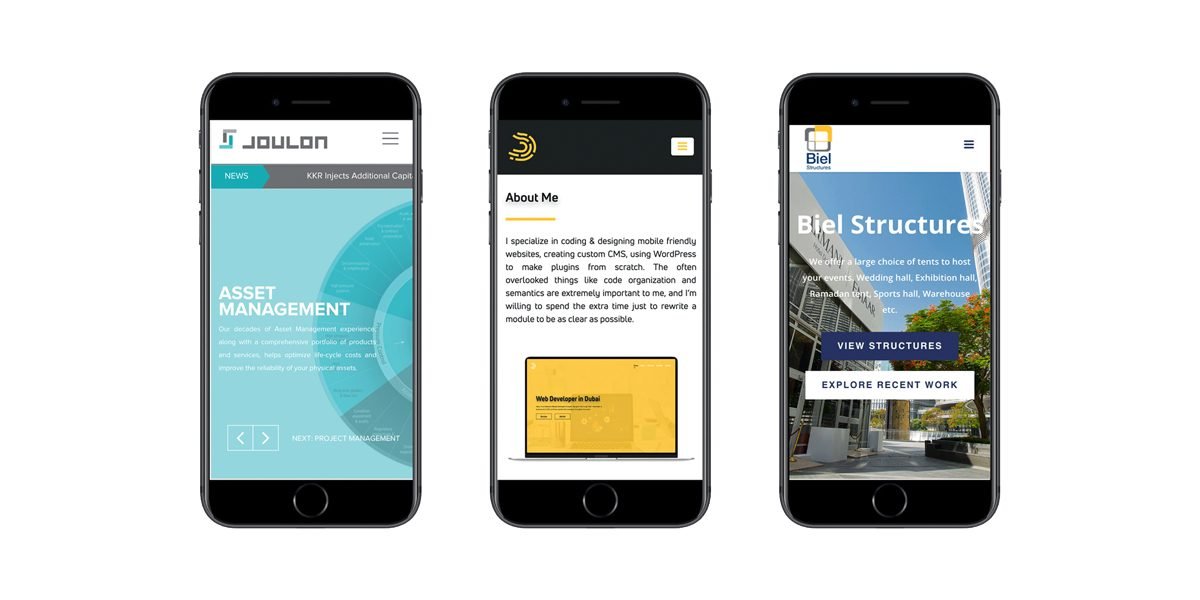
Typography, or the art of designing and arranging type, plays a crucial role in web design in Dubai. It not only contributes to the visual appeal of a website but also helps in conveying information effectively. In this article, we’ll delve into the various ways typography influences web design.

Establishing a Brand Identity
Typography plays a vital role in creating a brand identity. It is often the first thing that visitors notice on a website, and it can create a lasting impression. The font selection, size, and color scheme can all contribute to a website’s overall visual identity. It’s essential to choose a font that aligns with the brand’s personality and values. For example, a tech company may opt for a modern, sleek font, while a children’s website may choose a playful, whimsical font.

Improving Readability
The primary function of typography is to make content readable. The font size, line spacing, and line length all affect the readability of a website. If a font is too small or too cramped, it can make reading difficult and discourage visitors from staying on the site. On the other hand, if the font is too large or too spaced out, it can make the content look scattered and disjointed. Web designers must strike a balance between readability and aesthetics.

Creating Hierarchy and Emphasis
Typography helps create a visual hierarchy and emphasize important information. Headlines and subheadings should be in a larger and bolder font than the body text, which helps visitors quickly scan and understand the website’s content. Using different font weights, styles, and colors can also help create visual interest and guide visitors to the most critical information on the page.

Setting the Tone and Mood
The font selection can also help set the tone and mood of the website. Serif fonts, for example, convey a classic, traditional feel, while sans-serif fonts are more modern and minimalist. The use of script fonts can evoke a sense of elegance or whimsy, depending on the context. Font color can also contribute to the overall tone of the website. For example, warm, muted colors can create a relaxed, comforting feel, while bright, bold colors can convey excitement and energy.

Enhancing User Experience
The use of typography can enhance the user experience of a website. A well-designed font can create a sense of familiarity and ease of use for visitors. Web designers can also use typography to create clear and concise navigation menus, which can help visitors quickly find the information they are looking for. Consistent font usage across the website can also help create a cohesive and organized user experience.

Mobile Responsiveness
In today’s mobile-first world, web designers must consider typography’s role in mobile responsiveness. With smaller screen sizes, font size and line spacing become even more critical. Fonts must be legible and easy to read on smaller screens. Web designers may also choose to use larger fonts and more whitespace on mobile devices to improve readability and create a better user experience.

In conclusion, typography plays a significant role in web design in Dubai. It not only contributes to a website’s visual appeal but also helps convey information effectively and create a cohesive user experience. By carefully selecting fonts, colors, and sizes, web designers in Dubai can create a brand identity, improve readability, create hierarchy and emphasis, set the tone and mood, enhance the user experience, and ensure mobile responsiveness. A well-designed website should consider typography as an essential element in creating an effective and engaging user experience.

Best Practices for User Interface (UI) Design

User interface (UI) design is the process of creating interfaces that allow users to interact with digital products and services. UI design in Dubai is an essential component of user experience (UX) design, as it determines how users interact with digital products and services. In this article, we will discuss best practices for UI design in Dubai that can help improve the user experience and make digital products and services more user-friendly.

Keep it simple
Simplicity is key to good UI design. Users should be able to navigate and use the interface without any confusion. A simple UI design helps users quickly understand the layout, which leads to a more enjoyable experience. Some ways to keep the UI simple include using fewer options, concise language, and visual hierarchy.

Use a consistent design
Consistency is essential in UI design. Users should be able to navigate through the interface without having to relearn how to use it. Use a consistent design for layout, fonts, colors, and interactions. This makes it easy for users to learn how to use the interface quickly.

Make sure the UI is visually appealing
A visually appealing interface creates a positive first impression and can help increase user engagement. Use high-quality images and graphics, select an appropriate color scheme, and ensure that the fonts are legible. Good typography is important, as it helps with the readability of the text.

Provide clear navigation
Users should be able to find their way around the interface easily. Navigation should be intuitive and simple. Use labels that are easy to understand and make sure that the navigation is consistent throughout the interface.

Make sure the UI is accessible
An accessible UI design is essential, as it allows users with disabilities to access the interface. Some ways to ensure accessibility include providing alternative text for images, ensuring that the font size is legible, and making sure that the colors are high contrast.

Use appropriate white space
White space is the area between the elements on the interface. Using appropriate white space makes the interface look more organized and helps users focus on the content. It also helps to make the interface look less cluttered and more professional.

Use appropriate feedback mechanisms
Feedback mechanisms help users understand what is happening when they interact with the interface. When a user interacts with the interface, provide feedback on what is happening. For example, when a user clicks a button, the button should change color or provide some indication that it has been clicked.

Make it responsive
Users interact with the interface on different devices, such as desktops, laptops, tablets, and smartphones. A responsive design ensures that the interface looks good and is functional on all devices. A responsive design is important, as it provides a seamless experience for users across all devices.

Test the UI design
Testing the UI design is important, as it helps identify any issues that may affect the user experience. Conduct user testing to get feedback on how users are interacting with the interface. This feedback can help you make changes that improve the user experience.

Continuously improve the UI design
UI design is not a one-time event. Continuously improve the UI design based on user feedback, changing technology, and changing user needs. It is essential to keep the UI design up to date to keep users engaged and ensure that the interface is effective.

In conclusion, UI design is an essential component of UX design that helps determine how users interact with digital products and services. By using the best practices for UI design, you can create interfaces that are intuitive, user-friendly, and visually appealing. Keep it simple, use a consistent design, make sure the UI is visually appealing, provide clear navigation, make sure the UI is accessible, use appropriate white space, use appropriate feedback mechanisms, make it responsive, test the UI design, and continuously improve the UI design.


The Importance of Responsive Web Design

Responsive web design is a web development approach that allows websites to adapt to different screen sizes and device types, such as desktop computers, laptops, tablets, and smartphones. In a world where people access the internet from a wide range of devices, responsive web design is becoming increasingly important for businesses and individuals who want to create websites that are accessible and user-friendly across all devices.

There are several reasons why responsive web design in Dubai is important. One of the most significant is that it improves user experience. When people visit a website that is not optimized for their device, they may have to zoom in and out or scroll left and right to view the content. This can be frustrating and time-consuming, and can lead to a high bounce rate, meaning people leave the website quickly. With responsive web design, however, the website adapts to the screen size and orientation of the device, making it easy for users to navigate and consume the content.

Another benefit of responsive web design is that it helps with search engine optimization (SEO). Google, the world’s leading search engine, has indicated that responsive web design is its recommended approach for mobile configuration, and that websites with responsive design will be given priority in search results. This means that having a responsive website can help improve your visibility and ranking on search engines, which in turn can drive more traffic to your site and increase your business or personal brand’s exposure.

Responsive web design also offers cost-effectiveness and time-saving benefits. In the past, businesses and individuals would create separate desktop and mobile versions of their websites, which meant they had to invest in two different designs, two different sets of content, and two different development processes. With responsive web design, however, you only need to create one website that works on all devices, which can save time and reduce costs.

Finally, responsive web design is becoming more and more essential as mobile usage continues to increase. According to Statista, the number of mobile phone users is expected to reach 7.3 billion worldwide by 2023, which is more than the current global population. This means that having a mobile-friendly website is no longer a nice-to-have, but a must-have for businesses and individuals who want to reach their target audience and stay competitive.

To implement responsive web design, web developers use a range of techniques and tools, such as flexible grids, flexible images and media, and CSS media queries. Flexible grids allow web developers to create a layout that adapts to the size of the screen, while flexible images and media allow images and videos to resize automatically without losing quality. CSS media queries are used to detect the screen size of the device and apply the appropriate styles to the content.

While responsive web design offers many benefits, there are also some challenges to consider. One of the biggest challenges is ensuring that the website loads quickly on all devices, as slow loading times can lead to high bounce rates and a negative user experience. To address this issue, web developers can use techniques such as image optimization, content delivery networks (CDNs), and server-side caching.

In conclusion, responsive web design is a vital approach to web development that offers many benefits for businesses and individuals who want to create websites that are accessible, user-friendly, and optimized for all devices. With the continued growth of mobile usage, it is more important than ever to adopt responsive web design to stay competitive and reach your target audience. By using the right tools and techniques, web developers can create websites that are both beautiful and functional, and that provide a seamless user experience across all devices.

Responsive front-end frameworks

Responsive frameworks are grid structures that are used as the building block for scalable websites. It saves time by giving us the building blocks required to build an effective responsive website. In short, it is a set of code that can be reused so that developers are not constantly reinventing the wheel.

Responsive frameworks are Bootstrap, Base, The Responsive grid System, Foundation etc.

What’s the big deal about mobile first?

IMPORTANCE OF A RESPONSIVE WEB DESIGN

A responsive web design basically means a website which is highly responsive, fast and up-to-date and is mobile-friendly as well as desktop-friendly. There are many websites built by the freelancer web designers in Dubai that were desktop-friendly only. They used to be popular but the era has changed. Everything has become digitized. Many people now prefer to conduct the information from the websites through their mobile phones.

Now obviously desktop-friendly websites build by the previous web developers in Dubai was not responsive on gadgets such as mobile phones and tablets because they were not built to run on anything except the desktop.

But the time has changed. Many web developer in Dubai are designing the website with a mobile first design. A mobile first design is close to creating a highly responsive web design for the website. A  website with a mobile first design is much responsive than the other websites and more people would visit the website and interact and maintain a steady traffic rather than the websites which are only desktop-friendly. People do not use desktops anymore to conduct the information from a website.

A website built by a web designers in Dubai which does not have a mobile first design can readily decrease the web traffic and sales rate of your business. Obviously, if you website is not mobile-friendly, it will drive away half of your customers and would not increase your sales.

Some desktop-friendly websites are mobile-friendly too but they are built with mobile first design. This leads to a long loading time. A long load time annoys the customers and viewers and they run away to your competitors right away.

THE CONCEPT OF MOBILE FIRST DESIGN

The concept of mobile first design is the  manipulation of the website, by the web developers in such a way, that it makes the site eligible for the fitting into a small screen first rather than the big screen.

Some freelance web designers have the expertise of creating  a website with a mobile first design. A mobile first design not only helps you to maintain a steady traffic but it will also enhance the visibility and the ranking of your website on the search engines. Hence, increasing your sales rate and the net profit. A high responsive design and a mobile first design will determine the expansion and the success of your company or your business.

IMPORTANCE OF MOBILE FIRST DESIGN

A mobile first design introduced by the web developers in Dubai typically compresses your website to fit into a smaller screen. Your customers will have a fast access to the information that they are looking for. A mobile first design basically compresses the media of your website and enhances the user experience of your website.

If your customers will use a desktop web design on the small screens, the text would be a lot bigger, the images would crash or corrupt and the load time would be longer than usual. It will not only decrease the rating and the ranking of your website but it will also give the user a bad experience.

A website without a mobile first design annoys the users. They tend to close it as soon as possible because of the unresponsive web design. A professional Web developer in Dubai will build your website with a responsive and a mobile first design.

A mobile first design improves your site’s visibility and the web traffic. If your web traffic is good and your site is visible on the first page of the Google, you are likely to gain a lot of potential customers. If you gain a lot of potential customers, it is ultimately going to enhance your sales rate. If your sales rate increases, your business will benefit and expand. In short, a mobile first design represents your responsive behavior. And, a responsive behavior helps to expand your business like no other factor.

HOW DOES A MOBILE FIRST DESIGN BENEFIT YOU?

A mobile first design provides a same user experience despite of the size of your devices. By a mobile first design, your website which would be build by an expert web developer, would be responsive on small screens as well as the big screens.

It would give you the better leads to your business. You would be able to calculate the audience who uses the mobile phones to visit your website. A mobile first design makes a website fast and high performance machine.

FACTUAL INFORMATION TO SUPPORT MOBILE FIRST DESIGN

•There are more than 1.2 billion mobile web users all around the world that use the mobile specified search engines to visit the websites to conduct information.

•In the United States of America, 25% of the total mobile web users do not user a laptop, desktop or a personal computers. They rely on electronics devices to conduct information on the websites.

•Mobile applications are installed  10.9 billion times by the mobile web users.

•Mobile device sales are outdoing the sales of the desktops or other big screens. It means that people are using mobile phone more than the desktops.

ADVANTAGES OF THE MOBILE FIRST DESIGN

•The web developers in Dubai assures that the Mobile first design is accessible to any device. A mobile first design would open up your website on any platform and on any electronic device, whether a mobile phone or a desktop.

•It compresses the media, text and the related content to your business. It makes it easy for you and your viewers to access the information provided on the website.

•More people are using the mobile phones to conduct information from the websites. That is why, it will not only increase your web traffic but will also increase your site’s visibility.

•A mobile first design can by updated more easily by the web designers. They can add more to the functionality of the mobile first design easily and quickly. Hence, saving you the cost of the long codes.

•A mobile first design provides you with easy and quick navigation.

What is responsive web design

What is responsive web design?

Responsive web design facilitates the build of a single site that will work across multiple screen resolutions. For example, a responsive website may display in multiple columns when viewed on a desktop/laptop but automatically scale to two columns when accessed via a tablet and one column via a mobile phone.

Responsive front end frameworks

Responsive frameworks are grid structures that are used as the building block for scalable websites. It saves time by giving us the building blocks required to build an effective responsive website. In short, it is a set of code that can be reused so that developers are not constantly reinventing the wheel.

Responsive frameworks are Bootstrap, Base, The Responsive grid System, Foundation etc.

How to add custom tab to woocommerce product page

Woo-commerce Tab

Add a Custom Tab to Product Page

The ‘woocommerce_product_tabs’ filter provided by WooCommerce should be used as below to add a custom tab to a product page in WooCommerce. The code should be added to the functions.php file of your theme.

add_filter( 'woocommerce_product_tabs', 'woo_new_product_tab' );
function woo_new_product_tab( $tabs ) {
// Adds the new tab
    $tabs['desc_tab'] = array(
        'title'     => __( 'Delivery and Returns', 'woocommerce' ),
        'priority'  => 50,
        'callback'  => 'woo_new_product_tab_content'
    );
   return $tabs;
}

Add Content To Tab

To add custom content to the tab you have to add another line of code in the function.php file.

function woo_new_product_tab_content() {
  // The new tab content
  echo '<p>Goods will be delivered....</p>';
}

Reorder the Tabs

Custom tabs that have been added can also be rearranged as per the requirement. To achieve this the  ‘woocommerce_product_tabs’ filter has to be used once more. The code for the same will be as below.

add_filter( 'woocommerce_product_tabs', 'sb_woo_move_description_tab', 98);
function sb_woo_move_description_tab($tabs) {
    $tabs['desc_tab']['priority'] = 5;
    $tabs['reviews']['priority'] = 20;
    return $tabs;
}